Sunday, May 15th, 2016
Sand Colored Paint
Sand-toned paint suggestions offer a warm, neutral base that pairs easily with wood tones and natural light, making rooms feel calm and grounded.
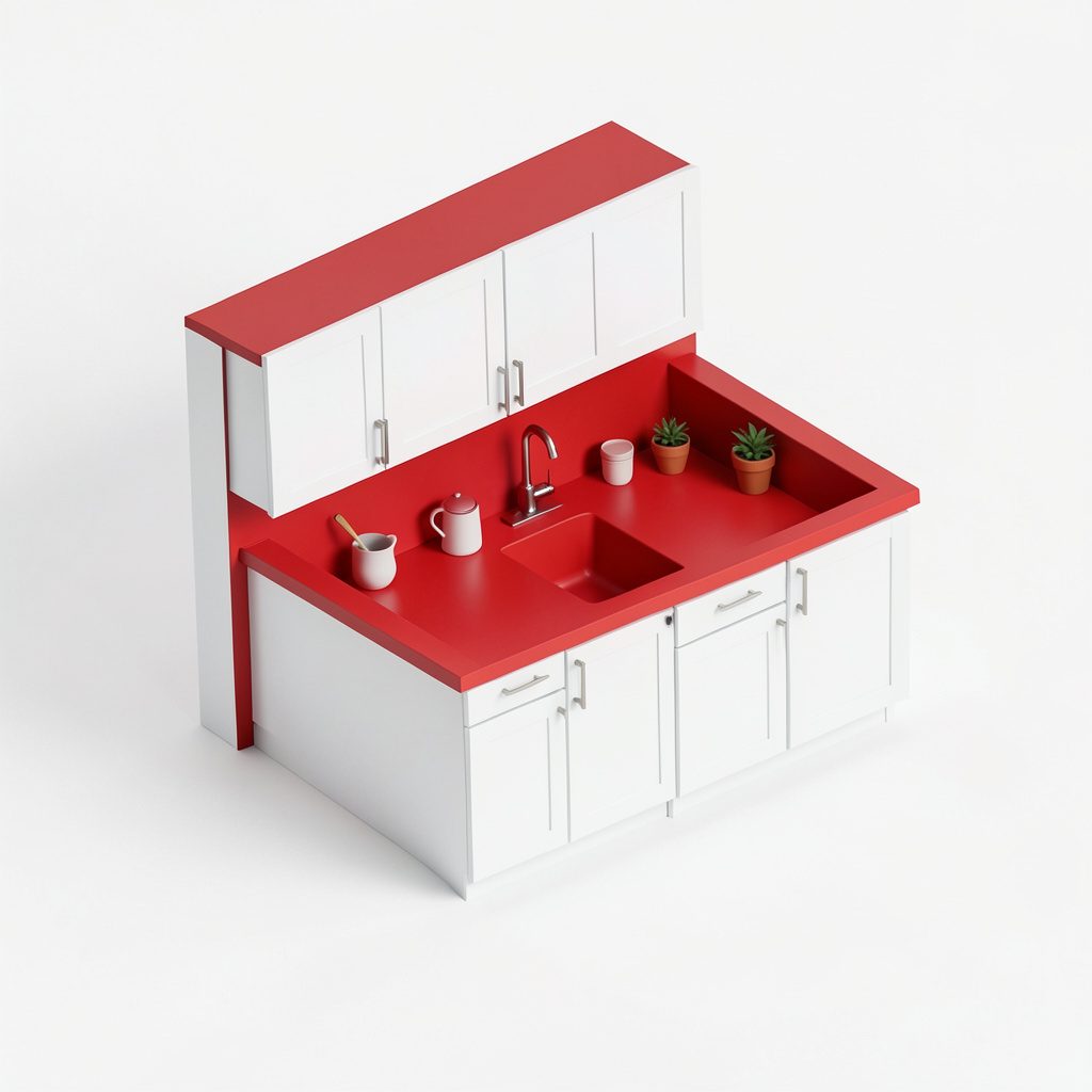
Paint palettes and color pairings for hallways, foyers, and everyday living spaces.
Color sets the emotional temperature of a home before any furniture is brought in. In hallways and foyers, where foot traffic meets first impressions, a thoughtful palette can guide visitors from the threshold into the living spaces beyond. Designers often start with a neutral base that reflects available light, then layer accent tones that echo materials used in adjoining rooms. This continuity makes narrow corridors feel intentional rather than transitional, turning simple passageways into cohesive extensions of the main interior story.
Choosing paint pairings is less about chasing trends and more about balancing contrast with harmony. A soft, low-saturation wall color can be grounded by a deeper trim shade, while a bold accent on a single door or niche introduces personality without overwhelming the eye. Many homeowners experiment with swatches at different times of day, since natural and artificial light can shift the same hue from warm to cool within hours. Pairing unexpected finishes, such as matte walls with satin trim, also adds subtle depth.
Hallways benefit from palettes that feel welcoming yet durable, since these spaces absorb scuffs, handprints, and the glare of overhead fixtures. Mid-tone colors with enough saturation to disguise minor marks, combined with lighter ceilings to keep the volume open, create a forgiving backdrop for everyday living. In foyers, color can quietly signal the mood of the rest of the home, whether calm and minimal or energetic and expressive, while still leaving room for seasonal decoration.
Color inspiration often comes from sources outside the paint chip aisle. Textile patterns, ceramic glazes, stone veining, and even the changing colors of a garden can suggest pairings that feel collected rather than matched. Translating these references into wall and trim tones involves softening strong contrasts, repeating a unifying hue across rooms, and allowing white space to give each color room to breathe. The result is an interior palette that feels personal, layered, and quietly confident.
Sand-toned paint suggestions offer a warm, neutral base that pairs easily with wood tones and natural light, making rooms feel calm and grounded.
Ideas for hallway and foyer paint colors focus on shades that keep narrow, low-light spaces feeling open, welcoming, and connected to adjoining rooms.
Beyond single-room choices, color coordination across living spaces ties cabinets, trim, and walls together. Sand and warm neutral families tend to complement wood cabinetry and stone or brick accents found elsewhere on this site, giving a cohesive look from hallway to kitchen.
These posts are meant as visual and practical starting points rather than fixed rules — swatch testing in your own lighting is still the best way to confirm a shade before committing to a full room.